Guide
Architecture drawn from the code
Where the architecture view comes from, what the dependency graph and structure matrix actually show, and how to read them against the design you intended. All guides
Watchdog · Guides
Getting started
What the survey sees
- Set your survey cadence — and the daily watch
- Architecture drawn from the code
- Security is not a CVE list
Putting it to work
Who this is for: engineers, architects and technical leads reading a survey of a codebase they work on. It covers what the architecture view is derived from, how to read its colours and confidence labels, why it is sometimes withheld, and where its evidence stops.
A hand-drawn architecture diagram starts drifting from the code on the next merge, and the cost of keeping it accurate falls on whoever remembers to. Watchdog takes the other route: it derives an architecture view - C4-style containers and components, boundaries and the deployment relationships your repository declares - from the source at the commit it scanned.
The view is inferred, not certified. It is a reading of the system taken from what your source and deployment descriptions say, and each node in the deployment view carries the source that declared it and how confident that reading is. Below: what it shows, how to read it, and how it connects to the findings you already act on.
1. Where the view comes from
One architecture model is produced per scan, and the Architecture tab renders that model rather than a diagram maintained separately. Every box, edge and boundary was resolved from the source at that commit. Re-scan after a refactor and the picture moves with the code.
Two properties are worth knowing before you lean on it:
- It adds no findings. Boxes are coloured by findings that already exist in the run, and drawing is a read-only operation over the model and those findings. One number is derived for the view itself, and §4 explains exactly what it is.
- It renders as an empty state rather than a guess. A repository that does not qualify for a diagram gets a message saying which case applies, not an invented one. §5 lists the cases.
You will find it on the repository's Architecture tab, at /ui/repo/{id}/c4. The diagram is plain SVG, so it renders without a client-side diagram library. When a deployable host groups your bounded contexts, the view is levelled: the container diagram is level 1 of 2, and clicking a container zooms into its components. When nothing groups them, you get a single flat component graph instead. Clicking a box or a red edge fills the detail panel either way.
2. The two views: what is declared, and how the code is organised
The deployment view is read from your repository's own deployment sources: Docker Compose, .NET Aspire, Kubernetes, Terraform, Bicep, Helm, AWS CDK and Pulumi. It shows deployable services, typed infrastructure - database, cache, queue, auth, storage, gateway - and the dependency edges between them.
Every node and edge in it carries two separate labels. Provenance is which source declared it and from which file. Confidence is how strongly that source supports the reading, on a scale of high, medium, low or inferred. Most of those sources are declared manifests - Compose, Aspire, Kubernetes, Terraform, Bicep, Helm - and read at high confidence. CDK and Pulumi describe infrastructure in imperative code, so what the extractor recovers there is genuinely inferred and labelled accordingly.
What this view establishes is what your repository declares should run, which is not the same as what is running in a given environment right now. Overlays, environment variables, generated configuration, manual changes and service discovery can all diverge from the committed description. Read it as the deployment story your repository tells, and use it to check that story against what you know operationally.
The C4 container and component model describes how the code is organised. Containers are the deployable hosts - web API, web app, worker, CLI, app host - plus the infrastructure they depend on. Components are the bounded contexts resolved from the code, each owning a set of files, with directed dependency edges between them. These become two zoomable levels only when a deployable host actually groups contexts; otherwise they collapse into the flat graph described in §1.
The practical payoff is the comparison. The deployment view answers "what does this repository say it deploys, and how do those pieces relate"; the component graph answers "does the code's internal shape match that story". Where they disagree - a service the manifests never mention, a context that reaches everywhere - that gap is the interesting part.
3. Reading the boundaries and the coupling
The component graph is where architecture drift shows first. Edges between contexts are directed, and a red edge marks a boundary violation: dimension D23, Boundary Type-Coupling, found a domain type crossing a bounded-context boundary. Click it and the panel names the leaked type and the exact member that exposes it. That is the difference between "your architecture is bad", which nobody can act on, and "this identifier value object crosses from Billing into Scheduling through this property", which someone can.
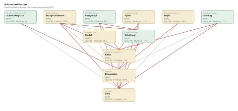
The component view of BEagle1984/silverback, from its published survey. Each box is a bounded context with its own health band and the finding density behind it; the red edges are D23 boundary type-coupling, and hovering one names the two contexts it crosses. The grey edges are ordinary dependencies.
The boundaries themselves are resolved from the code, not declared by you in a configuration file. That matters for how much weight a red edge carries: it is evidence that a type crosses a seam the analysis resolved, and the seam is as good as the resolution. Check the two contexts named in the panel before you plan work around one.
Behind the picture, the Architecture lens computes eight published dimensions:
- Coupling (D5) - afferent and efferent coupling and instability in the Martin sense, plus dependency-cycle detection across projects.
- Cohesion (D6) - LCOM4 per class, which counts how many unrelated jobs a class is doing, so the class doing five of them surfaces.
- Architectural Integrity (D7) - architecture-decision-record enforcement maturity combined with cycle detection: whether the intended architecture is enforced rather than only documented.
- Internal API Consistency (D22) and Boundary Type-Coupling (D23).
- Project Cohesion (D26), Navigability (D27) - how far a developer must trace to follow a call, judged against a size-aware baseline so a large solution is not penalised for indirection a small one would not need - and Change Coupling (D35), which reads from git history which files keep changing together.
Those eight are part of a catalogue of 127 entries across ten lenses, of which 42 are published dimensions with a citable code from D1 to D42 and 85 are meta-dimensions. The architecture view is the spatial reading of the architecture-lens subset.
4. The health overlay, and the number beside it
Each context is coloured by the density of findings across the files it owns - findings per file - in four bands: clean, fair, weak and poor. Clean is the label for a context with no findings mapped to its files in this run, which is not the same as a guarantee that nothing is wrong there: a dimension that abstained, a file the analysis excluded, or a finding that could not be mapped to a context all leave the same visual trace as a genuinely clean context. Read it as where findings concentrate, and read the run's abstentions beside it.
Density rather than count is the deliberate part. A large context carrying a few findings reads fair; a small context riddled with them reads poor. Clicking any context lists the findings in its files, so the view is a way into the ranked list rather than a dead end.
The number on a box says which of two things it is, because it comes from one of two places:
- health 85 is a 0-100 restatement of the same finding density that produced the colour, so the number and the colour always agree. Every component carries this, and so does a container on a repository the scan did not decompose.
- CAI 85 · findings poor appears on a container of a monorepo that the deep scan decomposed into services. The number is that service's own Codebase Assurance Index, computed over its own code; the colour is still finding density, which is why the band is named beside it.
The second pair are different measurements on different scales and can point in different directions: a service can carry a strong index and still be the densest concentration of findings in the repository. That is two facts rather than a contradiction. Use the colour to decide which box to open, and the index to judge the service as a whole.
5. When the view is withheld, and why
A component diagram is drawn only when the repository is organised into bounded contexts and at least two of them resolve. A one-box diagram is the noise the gate exists to suppress. The deployment view has its own floor: it draws with two or more nodes, because a single service is a box rather than a topology.
The empty states are distinct, and the product says which one applies:
- Not organised into bounded contexts — no component diagram to draw. The architecture is still scored: see the Architecture lens on the Overview and the Findings tab.
- One bounded context — the code does use domain-driven design, and the scan resolved a single context. A diagram needs two to show anything between them.
- No deployment view — fewer than two deployment nodes were resolved from the repository's manifests.
- Nothing rendered at all — the run produced no architecture model, or one this build could not read. That is a fault to report, not a verdict on the code.
Separately, a size-and-shape judgment decides whether having no declared boundaries is fine - a small or single-purpose codebase legitimately needs none - or a real gap, when a large modular codebase has grown without any seams. When a language model is available that judgment weighs size and shape together; without one, the fallback is a fixed threshold of 20,000 production lines. Which path runs varies; the fallback number does not.
6. Polyglot by design, and where the evidence stops
The analysis is polyglot end to end. When a repository is a composite of several languages, the boundary-coupling analysis runs across the combined type set, so a cross-context leak between two languages lands in the same view rather than falling into a gap between per-language diagrams. As published on 4 August 2026, the production catalogue held 13 languages: 12 analysed deeply and JavaScript analysed structurally. The catalogue is a live production record and may change, so check the current version at watchdog.canine.dev/api/public/language-support. The view reflects whatever the scan actually resolved.
Two limits to keep in view:
- This is a static, inside-out reading built from source and manifests. It describes what the code and the deployment descriptions say. Running the system, probing it from outside, dynamic scanning and penetration testing are a separate discipline, and runtime behaviour is not something this view can see.
- It is derived from the repository contents the scan can read, so no architecture linter, dependency-rule configuration or CI integration has to exist first, and there is no second diagram to keep in step with the code. Where you do run those tools it complements them: it adds a cross-language view, tied to the commit, with the findings attached.
7. Putting it to work
- Open the Architecture tab after a scan. If the deployment view drew, start there. Check that the services and infrastructure match what you believe is deployed, and look at anything labelled low confidence or inferred - those come from imperative infrastructure code, and are the ones worth confirming against your own deployment before you rely on them.
- Scan the component graph for red edges. Each is a named type crossing a named boundary. Open one, read the leaked type and the member that exposes it, and judge the work from there: some are a one-line move, others mean relocating a concept.
- Follow the colour. Open the densest context, click into its findings, and work the ranked list there. Density points at concentration, which is a good place to start and not automatically the biggest risk in the system - a thinly-populated context on a critical path can matter more.
- Re-scan and watch it move. Because the view is derived, a genuine refactor shows up as boxes merging or splitting, edges losing their red, and bands lifting. Where the picture changes without the architecture changing, the extractor resolved something differently, and the provenance labels tell you where to look.
Learn more and verify
In the product: the Architecture tab on any repository, at /ui/repo/{id}/c4. For a published open-source repository the same view is served anonymously at /api/public/c4/{owner}/{name}.svg.
The dimensions behind the view are D5, D6, D7, D22, D23, D26, D27 and D35, each with its lens, evaluator and rubric version in the published catalogue.
Noise and accuracy. Watchdog's design target is below 5% noise, on a deliberately broad definition: a finding counts as noise if it is a false positive, states opinion as fact, duplicates another finding, or is irrelevant to the shape of the code. That is a bar we hold ourselves to, not a measured result - and it is not uniform. Each language is calibrated separately, so some sit well below the bar today and others well above it; the ones added most recently have had the least of that work.
Your own map is the specific answer. Where this guide describes the general case and your repository's view shows something different, work from the view and its provenance labels, and check anything load-bearing against the source files it names.